
IVA Application
Rebranding, Product Redesign & Design System Transformation
Sadad PSP's Core Application
Organization: Sadad Electronic Payment / PSP
Roles: Product Design Leadership, UX/UI Strategy, Rebranding, Design System, Team
Leadership
Key Outputs: Brand Evolution, UX Architecture, UI Redesign, Design System, Component
Library
Approach: Product Design Lifecycle / Data-Informed Design
PLatform: Mobile Application
Industry: Digital Payment, Financial, Fintech, Banking
Year: 2024-2026
The Context
When redesigning an application means redesigning its future
IVA was already a mature product with a significant installed base.
According to internal project figures, the application had approximately 10 million
historical installations and around 800,000 active users at the project baseline.
These users were not simply numbers.
They represented established behaviors, expectations, mental models, and trust built around
the product. We were therefore not designing a new product for an empty market.
We were redesigning an established financial product while its ecosystem, services, users,
and operational dependencies were already in place.
That fundamentally changed the nature of the challenge. The question was not simply:
How can we make IVA look better?
The real question became:
How can we evolve a mature financial product without losing the value, trust, and
familiarity that already exist?
The Trigger
Five years of accumulated distance
One of the defining characteristics of the project was the significant gap between the
previous design/development cycle and the new transformation.
Approximately five years had passed since the previous major product design and development
cycle.
During that time:
- User expectations had changed.
- Digital product patterns had evolved.
- Competitors had become significantly stronger.
- The product's service ecosystem had expanded.
- UX issues had accumulated.
- Visual and interaction patterns had become outdated.
- Product strategy had evolved through different management periods.
- And the gap between the existing experience and contemporary digital-product standards had
become increasingly visible.
The five-year gap also created an important forecasting problem. Historical
assumptions were no longer always reliable enough to predict:
- user behavior,
- adoption,
- switching,
- time-to-market,
- and the safest release strategy.
This made the project considerably more uncertain than a conventional redesign.
A Transformation,
Not Just a Redesign
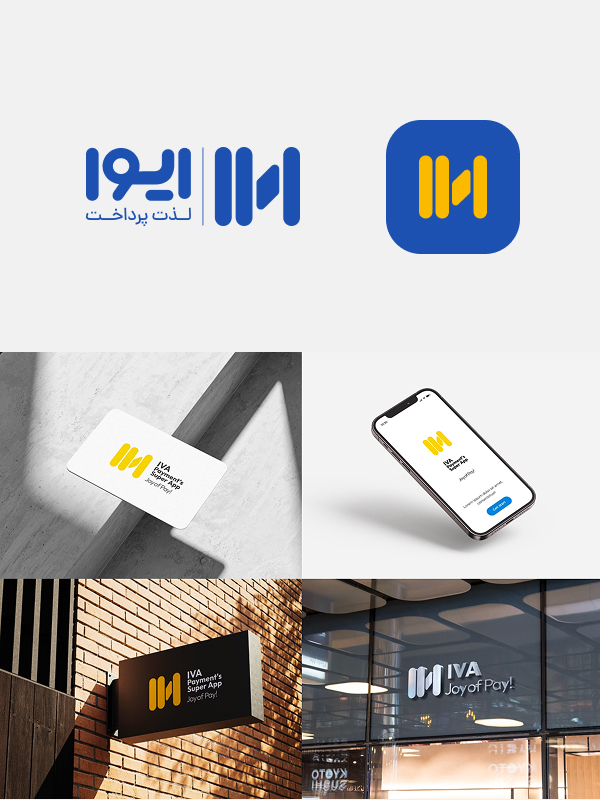
One of the most important strategic decisions was to treat rebranding and product redesign as
interconnected transformation streams, rather than two independent projects.
The rebranding initiative started before the application redesign.
However, the brand was not considered a finished deliverable that would simply be handed over to
the product team.
Instead, the new identity continued to evolve throughout the UX and UI design process. The
application became one of the most important environments in which the new brand could be
tested, challenged, and matured.
This created a continuous relationship:
Brand Strategy
↓Product Experience
↓UI Language
↓Design System
↓Brand Maturity
The Core Challenge
Five years of accumulated decisions
In a typical redesign, the previous product can provide a relatively reliable baseline. In IVA, the five-year gap meant that this baseline itself had to be questioned. We had to reconsider fundamental assumptions:
- Which parts of the existing experience were still valuable?
- Which behaviors represented genuine user needs?
- Which behaviors were simply habits inherited from the legacy product?
- Which services deserved greater prominence?
- How should a growing portfolio of services be organized?
- How much change could existing users reasonably absorb?
- How could we introduce a fundamentally different experience without destroying
familiarity?
- What would be the safest path for version switching?
- How could we forecast the impact of the redesign with incomplete or outdated historical
assumptions?
The project therefore required continuous balancing between:
Innovation ↔ Familiarity
Business Goals ↔ User Needs
Design Quality ↔ Technical Reality
Speed ↔ Long-Term Scalability
Product Design Approach
Designing from evidence rather than preference
The project followed a structured Product Design Lifecycle rather than starting directly with UI design. The process began with understanding the product, its users, its competitive environment, and the accumulated experience debt.
01 — Benchmarking
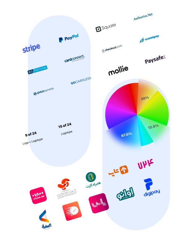
We benchmarked comparable payment and financial-service products to understand contemporary
patterns across:
- Service Discovery
- Navigation
- Card Management
- Payment Flows
- Financial Information
- Service Categorization
- Mobile Usability
- Interaction Patterns
- Visual Hierarchy
The objective was not to copy competitors.
It was to understand:
Where had the experience standard of the category moved, and where should IVA position
itself within that landscape?
02 — Product & Experience Analysis
The existing IVA experience was analyzed from multiple perspectives:
- Information Architecture
- Navigation
- Service Discovery
- User Flows
- Interaction Patterns
- Visual Consistency
- UX Issues
- Design Debt
- Existing User Mental Models
A core principle guided this stage:
Before redesigning what exists, understand why it became what it is.
03 — Reframing the Service Architecture
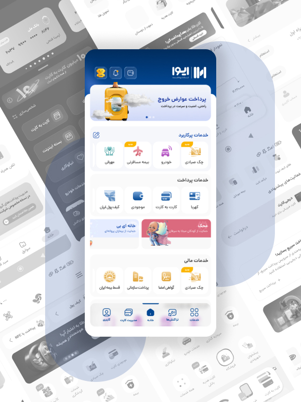
IVA had evolved into a broad ecosystem of services. The challenge was no longer simply
presenting individual services. The new experience therefore moved toward a more structured
service architecture, creating clearer relationships between services and their strategic
priorities.
The redesigned Home experience introduced clearer areas for:
- Featured / Shortcut Services
- Payment Services
- Financial Services
- Utility Services
- Promotional & Communication Content
- Primary Navigation
This allowed the interface to move from a collection of services toward a more coherent product
ecosystem.
UI/UX Redesign
Simplifying a complex financial ecosystem
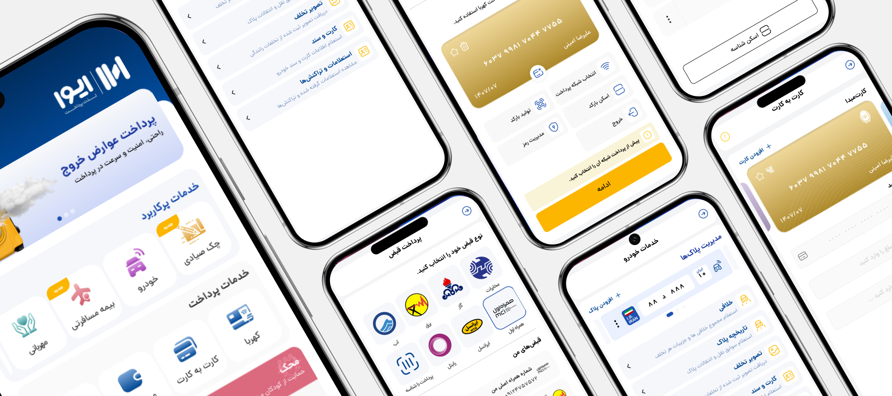
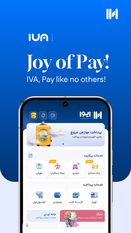
The new UI direction introduced a substantially different visual and interaction language compared with the legacy experience.
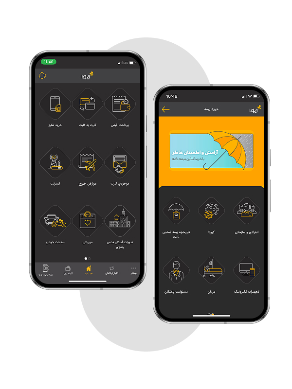
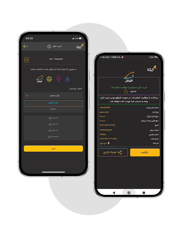
The legacy version relied heavily on:
- A dark visual environment
- Yellow and gray accents
- Dense service presentation
- Older interaction patterns
- Less differentiated hierarchy
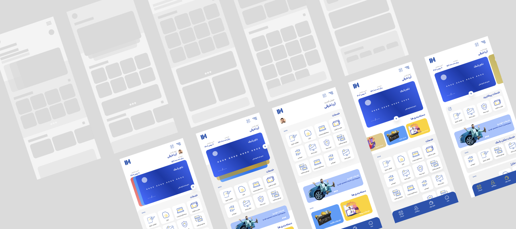
The new direction moved toward:
- A blue-led brand identity
- A lighter and more structured interface
- Modular service architecture
- Stronger visual hierarchy
- More consistent iconography
- Clearer primary actions
- More contemporary interaction patterns
- Greater visual breathing room
The objective was not simply to make the application more modern.
Designing for Existing Users
Change without unnecessary disruption
One of the most difficult design decisions was determining how much to change.
A redesign can be visually and technically successful while still failing if existing users feel
that the product they know has disappeared.
This was particularly important for IVA.
With millions of historical installations and hundreds of thousands of active users, existing
mental models had to be treated as part of the design problem.
Therefore, our objective was not:
Make everything different.
It was:
Change the experience without unnecessarily breaking the user's mental model.
Building the Design System Alongside the Product
Designing the product and the system simultaneously
Another major challenge was that we were not simply implementing an established Design
System.
We were building the foundations of the Design System while designing the product itself.
This created an additional layer of complexity.
The team was simultaneously:
1. Solving existing product problems
2. Designing new screens and flows
3. Creating reusable components
4. Defining design rules
5. Documenting decisions
6. Building the foundation for future scalability
This placed significant pressure on the team's time and capacity.
But it was strategically necessary.
Without a Design System, the redesigned product could easily have become another collection of
individually designed screens.
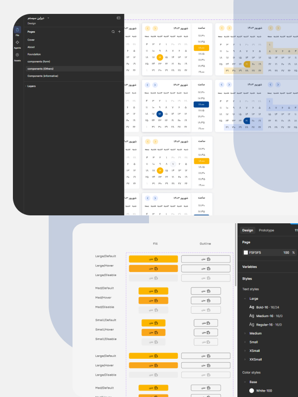
Design System as Strategic Infrastructure
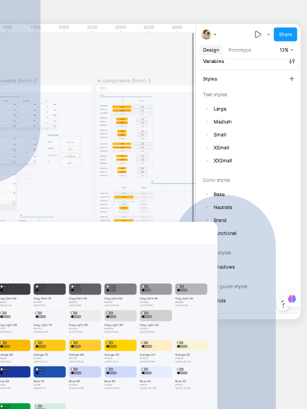
The Design System was therefore treated as more than a UI library.
It became a foundation for:
- Consistency
- Scalability
- Faster decision-making
- Better Design–Development collaboration
- Reduced duplication
- More predictable future evolution
The system addressed foundations and reusable patterns across areas such
as:
- Color
- Typography
- Spacing
- Grid
- Iconography
- Buttons
- Inputs
- Cards
- Navigation
- Tabs
- Feedback States
- Transaction Components
- Service Components
- Error & Empty States
The objective was not simply to make the new version visually consistent.
It was to make future design and development more systematic.
Team & Design Leadership
Building the capability required to deliver the transformation
The complexity of the project could not be addressed through interface design alone.
As Product Design Manager, one of my key responsibilities was building and leading a
professional, committed design team capable of handling the scope of the transformation.
The team had to operate across multiple levels:
Strategy → Research → UX → UI → Design System → Product Collaboration → Delivery
This required moving beyond a screen-production mindset.
The Release Challenge
Launching a new version is not the same as releasing it
For an application with millions of historical installations, release planning becomes part of
the product experience.
The question is not simply:
When will the new version be ready?
The more important question is:
When and how can we introduce the new experience without damaging trust, usability, adoption, or satisfaction?
- The five-year gap made this particularly difficult.
- Predicting user behavior was harder.
- Forecasting adoption was harder.
- Determining the ideal time-to-market was harder.
- And defining a safe path for version switching required careful consideration.
- Therefore, release strategy could not be separated from Product Design.
The transition itself was part of the experience.
What Has Proved
01 — Redesign is not Transformation
Changing the interface is relatively easy. Changing the direction of a product is much harder.
02 — A Brand is Experienced, Not Displayed
The brand becomes real through every interaction users have with the product.
03 — Legacy is not Always Technical
Technical debt is visible. Experience debt and organizational debt are often much harder to see.
04 — Design Systems are Strategic Infrastructure
It is a mechanism for creating consistency, accelerating decision-making, and enabling future product growth.
05 — Existing Users are Part of the Product Architecture
When millions of people already know your product, their mental models become part of the design problem. A successful redesign must respect what users already understand while giving them a reason to move forward.
06 — The Hardest Change Happens Before the Screen Changes
One of the hardest parts of transformation is not changing the interface. It is aligning people inside the organization around a new way of thinking about the product.
Conclusion
IVA was one of those projects where the final screens represent only a small part of the actual work.
Behind the interface was a much larger transformation:
A brand being redefined.
A product being reconsidered.
A Design System being built.
A team being formed and developed.
Stakeholders being aligned.
And an established user base being prepared for a new experience.
Today, the product has reached a more stable state, with all related teams sharing the ambition
of rebuilding IVA's position and bringing it back to stronger days.