
Dental E-Commerce Website
Design and Development of an Enterprise Online Shop
MIB Dental E-Commerce Website
Roles: Lead UI/UX Designer, Project Manager
Tools: Figma, Photoshop, Illustrator, VS Code
Technologies: Responsive, PWA Based, .Net Core
Year: 2021
Design Process
I started with conducting a business analysis, benchmarking and owner interviews with the goal of spotting opportunities for design, understanding users’ expectations and discovering about current vs ideal market position.
Simultaneously with the preparation and setting up of the initial structure and infrastructure of an online store for the company (MIB), I organized a three-member team dedicated to analyzing and collecting the user behavior and habits through user research and testing process in this project, the users which were consisted of dentists and laboratory managers. .
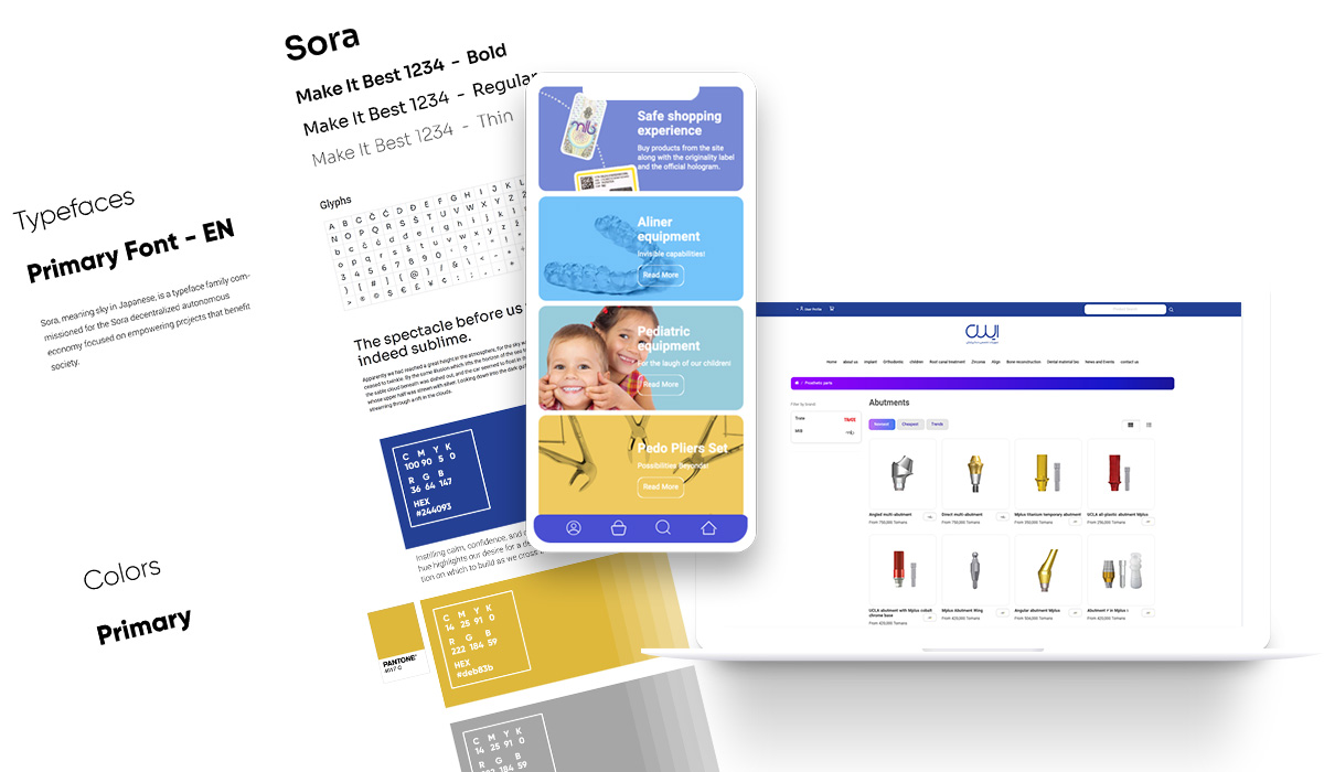
User Testing and Personas
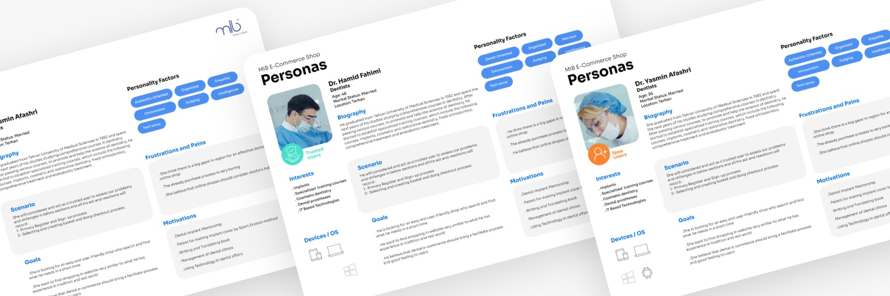
User Testing Tasks
Task 1: What will you encourage to register in website and leave your data here? (Focus on some mandatory and legal fields which doctors should fill in register form)
Task 2: Which information is not comfortable to you in product detail page?
Task 3: What makes it easy and fast when you select your desired products and are you comfortable with checkout and basket process?
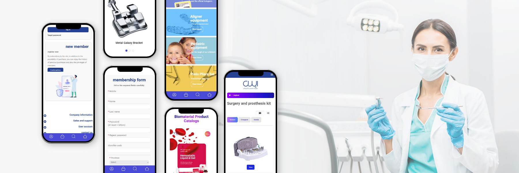
Challenges
Through repeating the user research and tracing the pains and needs of those selected users, we found that the critical issue and challenge we are encountered is the big gap between the final product online purchasing with their experience in the real and physical world.
'Almost 70% of audiences' desire was to buy conventionally!'
We found that selling dental products is not similar to other consumer products experienced on other websites and platforms and this service does not meet the expectations and needs of 70 percent of the target audiences.
As a result, the final sale did not take place and the operating process was practically lower than expected.
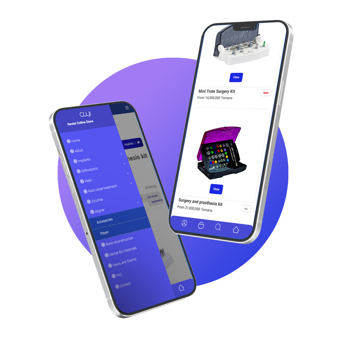

Therefore, by researching and focusing on their behavioral algorithm in traditional methods, we came up with a solution that led to the design and production of a new service and process as a promotion. This solution both met the needs of users and had a direct impact on sales.
' Lack of a process to create a package of products'
In this service, we paid attention to the needs and results of user experience tests with high sensitivity, and we were able to design and develop a service with the possibility of selecting, aggregating and building packages based on the products in the database, which even made it possible to customize the order.
Solutions
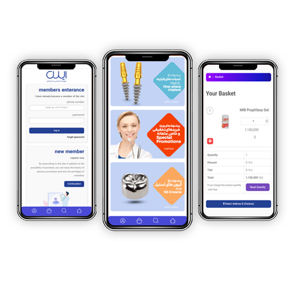
Sign-up Process Improvement
Changing and improving the previous sign-up form process and fields to make it more facilitating to register by omitting the number of mandatory fields (such as MED ID, National ID … and asking them to fill further) and also improving in UI of the registration form based on UX research and testing which finally lead to increase the user registration rate.
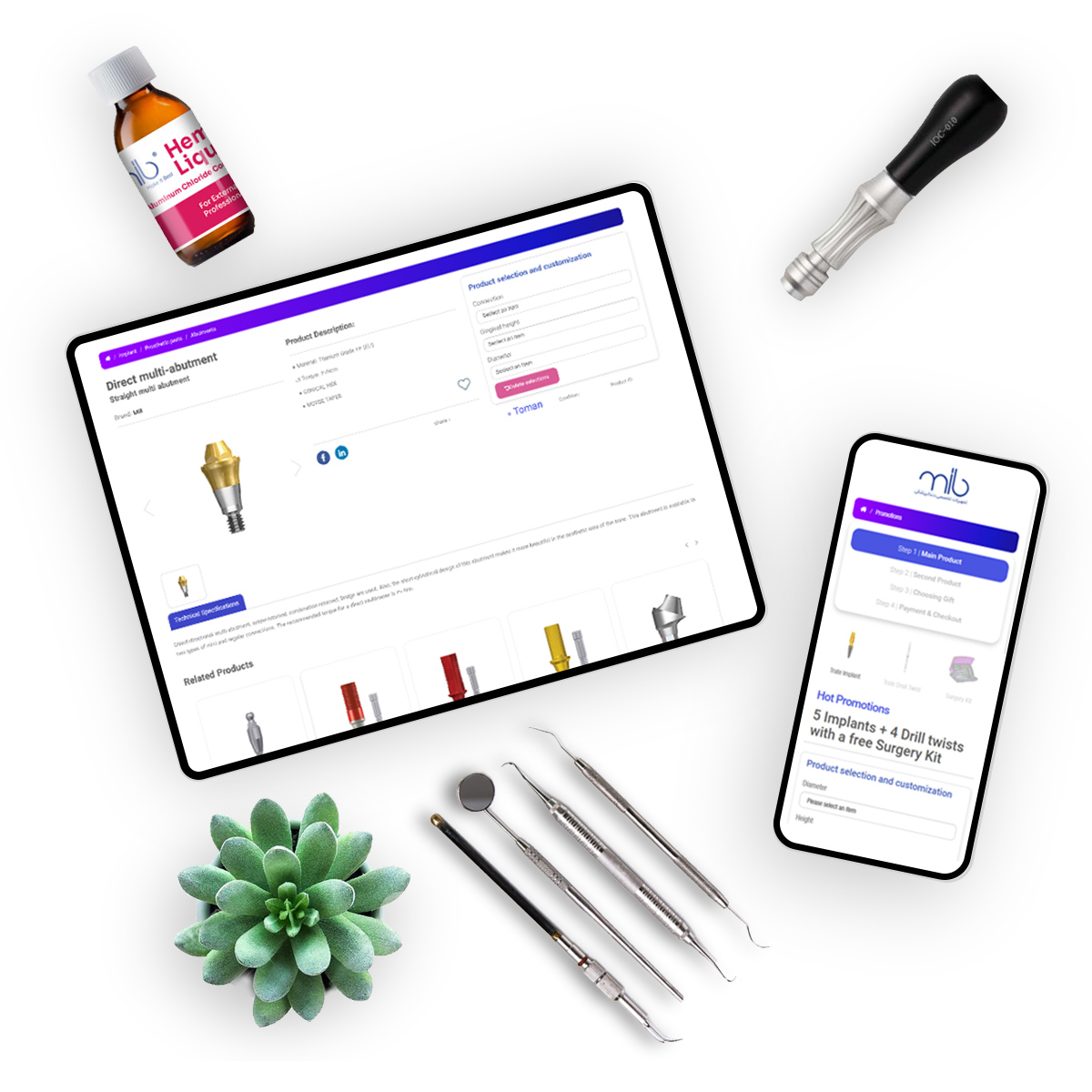
Creating Promotion Platform
Based on user research and interviews we have found that here in this project as a dental e-commerce platform, users are unique with specific habits and they are very tradition-orient in their actions about purchasing dental materials and instruments. That means we should change the way of showing and listing the products and even the ordering process due to UI/UX aspects.
Outcomes and Conclusion
Apart from the structural and technical similarities in e-Commerce platforms, facing users by specific behavioral patterns was one of the main results and great experience I have gained in this project. It also proved to me again that accuracy and consideration of user behavior and habits are the key to fundamental success and will also be a competitive advantage of the platform and system.
