Project Goal
To display information and charts which will generate automatically and in real-time, as well as to provide and design simple access and understandable menus without complexity while having a lot of content.
Problem / Challenge
The core challenge in UI/UX aspect was facing the multi-stage structure of the information as well as the multiplicity of the main content and topics which should be selected simultaneously and also affect the final result.
Solution
To solve this main challenge, the multi-tab model has been selected and designed which helps users get rid of confusion.
Sign-in Page
UI Design for the first step of user action to login to the software

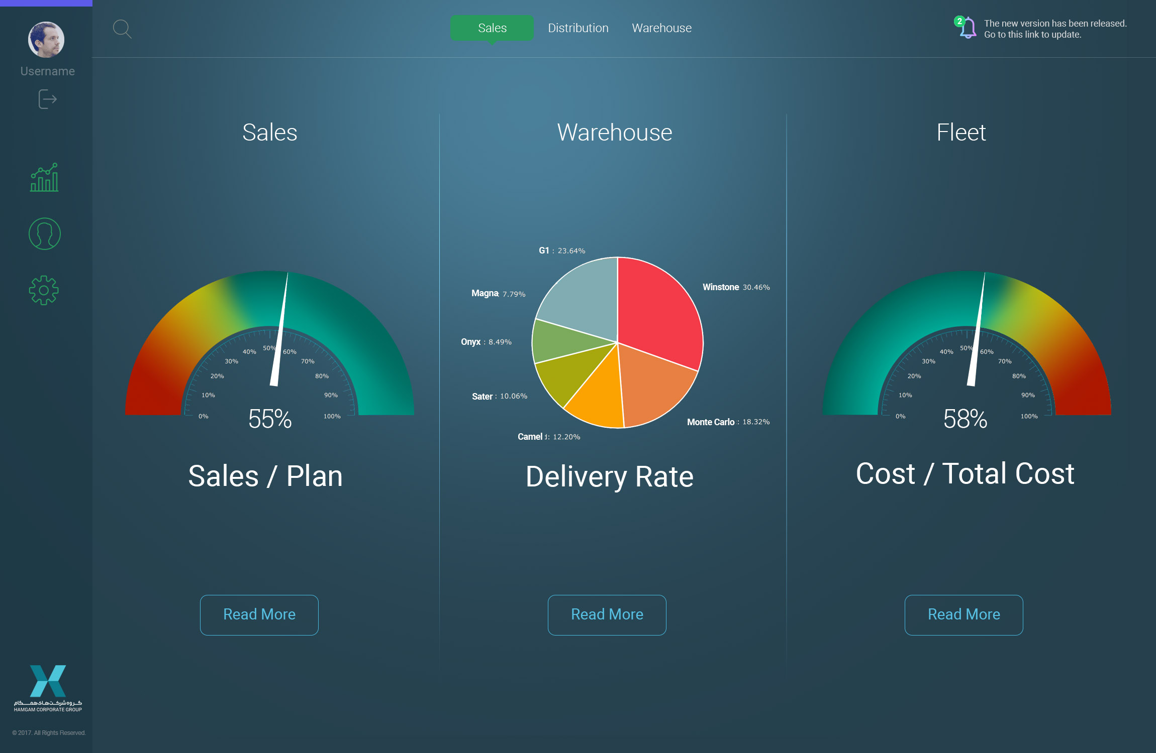
Enterance Page UI
UI/UX design for the first view of the dashboard which delivers most important data analysis with chart types
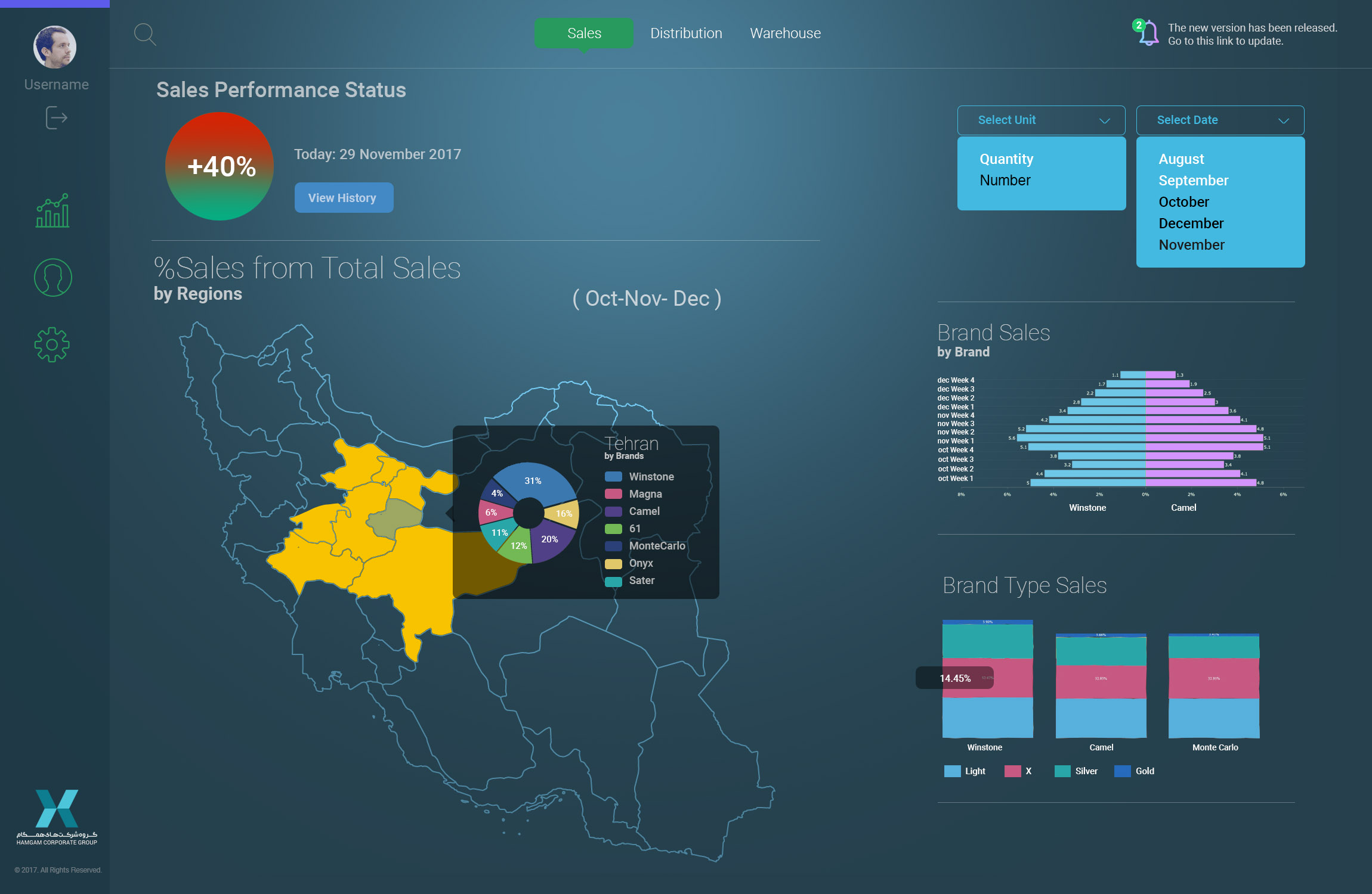
Performance Status UI
UI/UX design for showing all data related to the selected main item
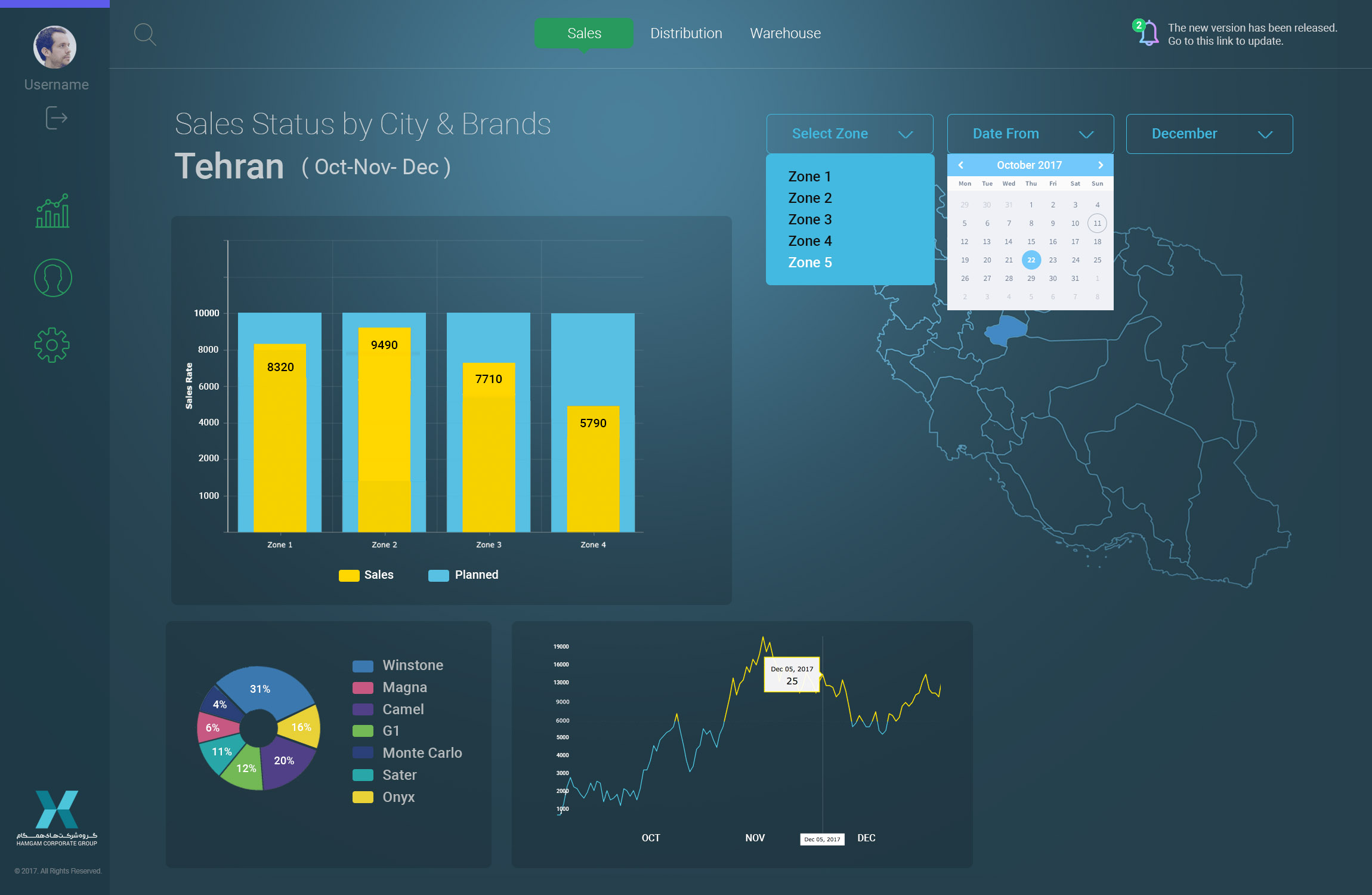
KPI Status
UI/UX design for selected KPI status with ability to filter
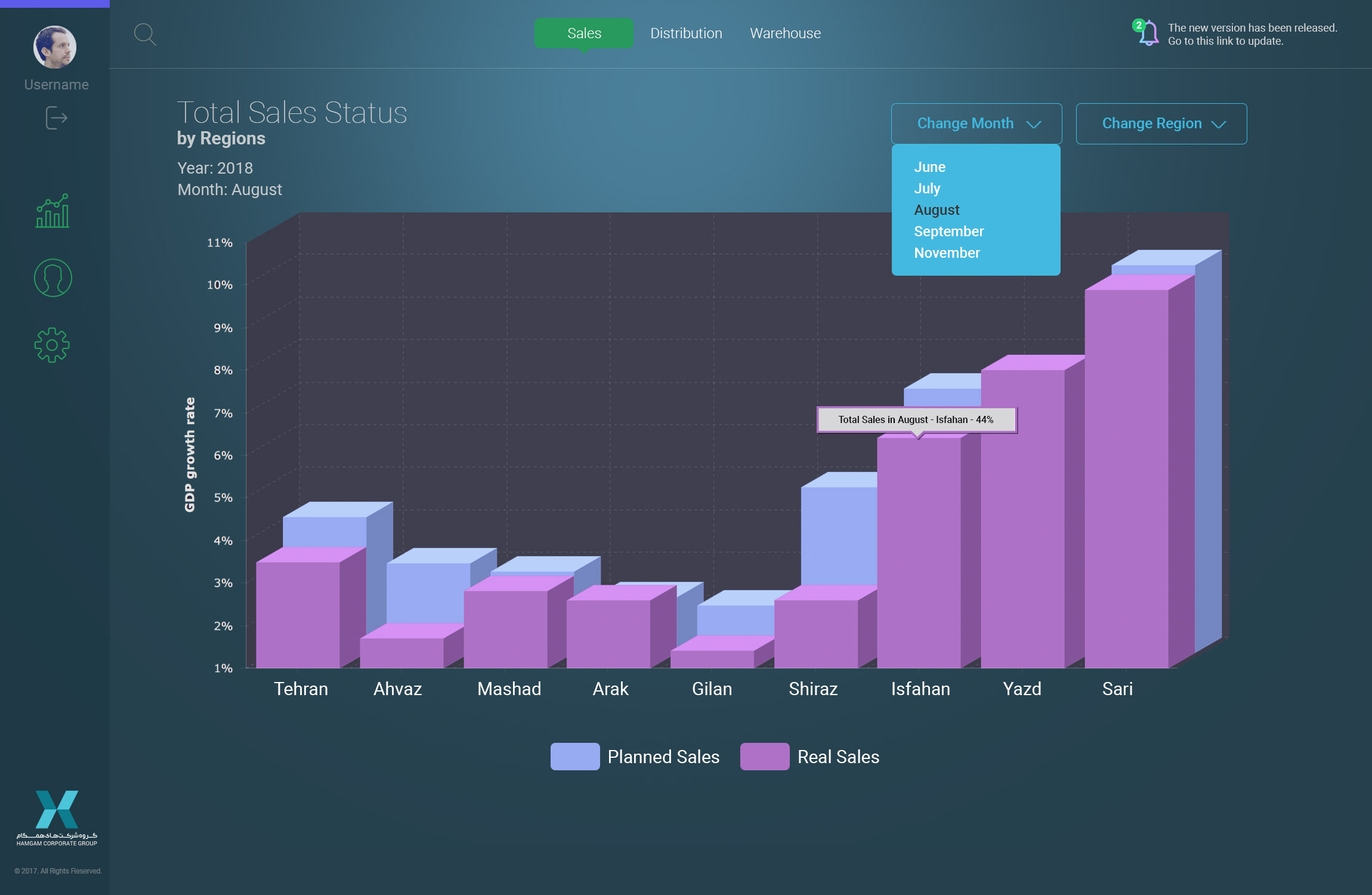
KPI Status with Chart
UI/UX design for selected KPI status with the ability to filter and based on chart types
Event Timeline UI
UI/UX Design for main upcoming events based on line chart with tooltip notifications and user-side timespan changer
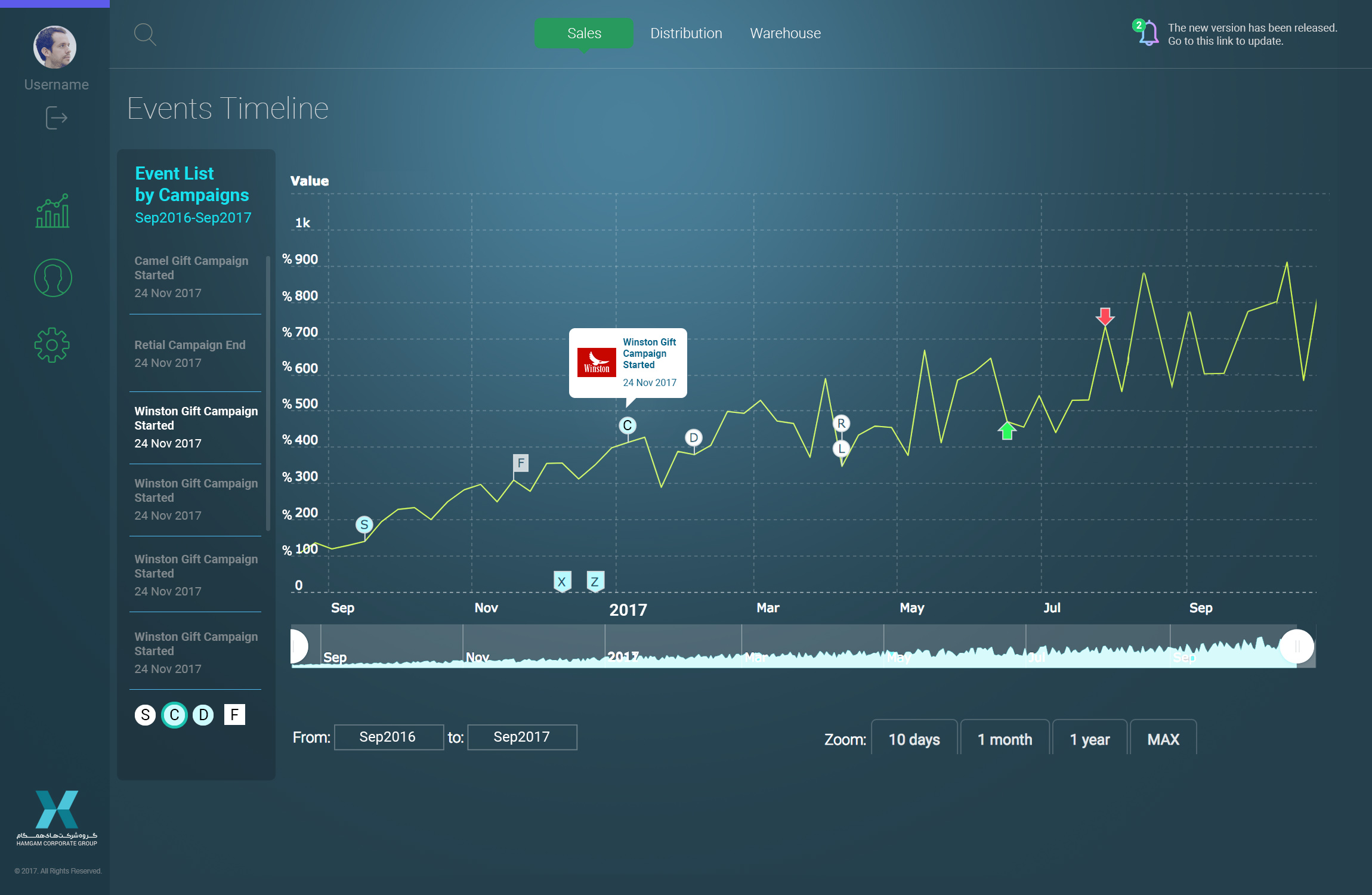
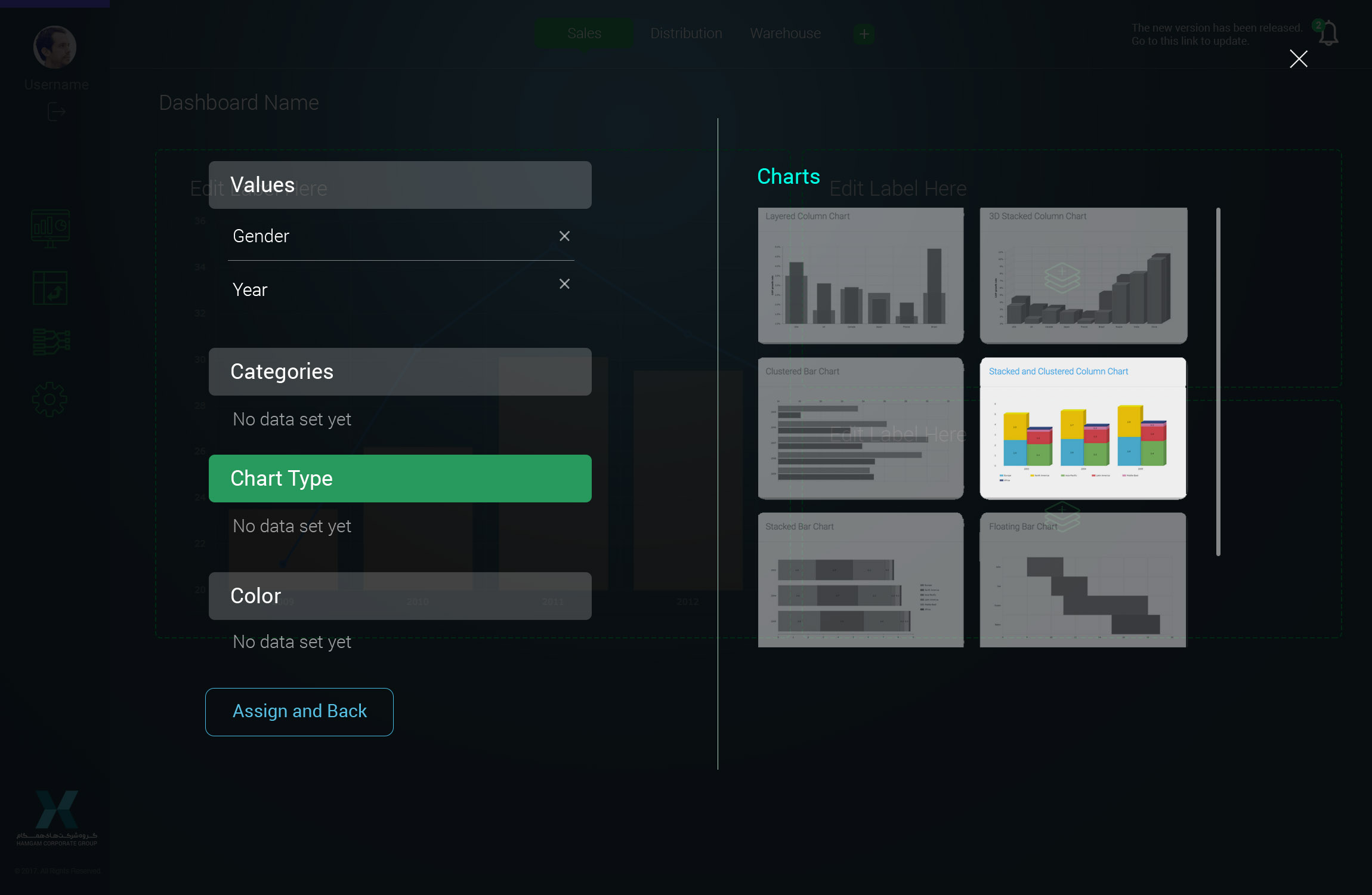
Chart Type Select
UI Design for selecting and assigning data values to desired chart type
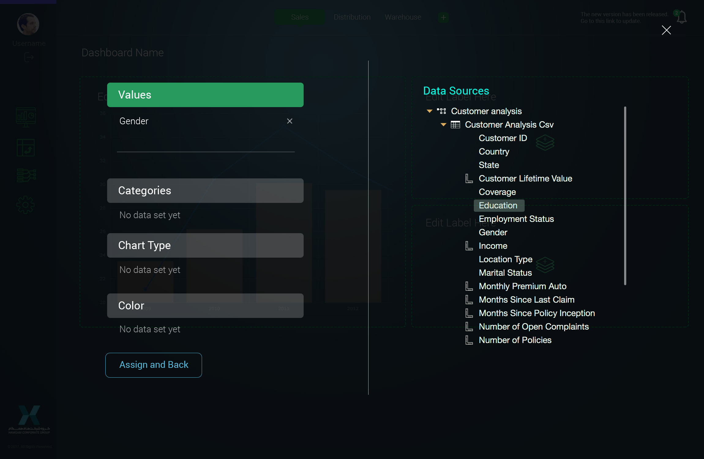
Data Assignation
UI/UX Design for data assigning from different data sources and categories
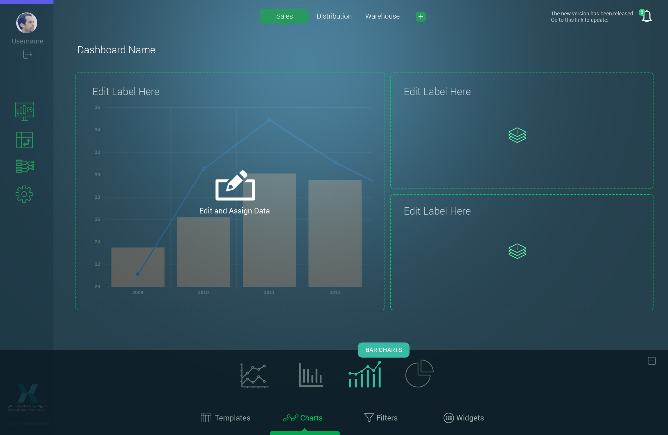
Page Creator
UI/UX Design for creating a KPI template with a Tab system and multi-layer data selection
Get In Touch
I'm eagerly waiting for your contact, question, comment or quotations request.
Send Message Now